

Inside Forett [2/3]: Bringing Vision to Life – Materiality, Adjustments, and Execution

Inside Forett [⅔]: post-construction and pre-FFE
The design was clear from the start of the build—restrained, thoughtful, and rooted in Japanese spatial sensibility.
But clarity on paper doesn’t always guarantee clarity on site. It’s a dialogue between vision and constraint—between what is imagined and what is possible.
In Part 1 of this series, we explored the conceptual foundations behind a 474 sqft apartment shaped by a Modern Japanese design ethos. With zoning strategies and core philosophies defined, Part 2 turns the spotlight onto the construction process: how those ideas evolved when met with the realities of site conditions, material limitations, and detailing challenges.
This article explores how design intent was translated into built reality—through technical decisions, careful material coordination, and on-site problem-solving during construction. From resolving cabinetry beam conflicts to refining lighting strategies, balancing dominant materials to incorporating subtle accents and demands on workmanship—Part 2 offers a deep dive into how the vision was realized in built form.

Early-stage Conceptual Material Boards
This article unfolds in four parts:
1. Material & Color Strategy
We begin by unpacking how a palette of ten materials was composed, categorized, and mapped to define the home’s visual identity. From dominant timber tones to bold accent tiles, every selection was deliberate—chosen not only for aesthetics, but for how it would guide spatial flow and hierarchy.
2. Zone-by-Zone Execution
Next, we examine the construction phase across each spatial zone—Utility, Flex (Study & Balcony), Transitional, and Living—detailing the adjustments made on site, the challenges encountered, and how each refinement stayed true to the original design intent. This journey through execution reveals the thoughtful layering of function, tactility, and visual coherence that brings the home to life.
3. Lighting & Ceiling Strategy
This segment explores the lighting philosophy and ceiling treatments that frame and elevate the spatial narrative. From layered illumination to timber-accented recesses, we examine how atmosphere was sculpted through light, shadow, and proportion.
4. Installation & Finishing Strategies
Finally, we reveal the precision and craft behind the final execution. From stone alignment and joinery solutions to silicone detailing and edge profiles, this chapter details how the finishing touches brought depth, clarity, and resolution to the vision.
Material Strategy: Crafting a Unified Visual Language

Mutina Rombini Brun tiles
In a space as compact as 474 sqft, every visual decision carries weight. Too many materials or colors, and the space becomes disjointed. Too few, and it risks feeling flat. Early in the process, we knew the flooring—the developer’s existing grey marble—would remain. Grey, as a base tone, was neutral enough to support bolder gestures throughout the material composition and spatial framework.
From there, we built a strategy around three major material themes: warm timber, grey stone, and select color accents. Timber would be the dominant element, grounding the space with warmth and cohesion. One single timber finish was used across all major carpentry: kitchen cabinets, bedroom platform, study desk, and TV wall. Stone was reserved as a visual anchor—used generously to introduce weight and tactility, uniting various zones into a coherent material composition. The balcony flooring, designed to feel like an extension of the interior, was finished in Balau timber decking—a hardwood species native to Southeast Asia, widely used in Singapore’s landed homes for outdoor terraces and pool decks.
Accent materials had to be carefully considered. White matte laminate was used sparingly on wardrobe doors and storage drawers for visual relief. Warm Japanese-textured wallpaper added another layer of tactility and softness across selected wall surfaces. The statement moment, however, came from a bold red ceramic: Mutina’s Rombini tiles. Installed beneath the half-height countertop separating bedroom and living, this striking texture felt reminiscent of Japanese lacquerware. When I encountered Rombini Brun tiles, the form and color immediately answered what I had envisioned—a powerful expression of transition, tied to movement and ceremony.
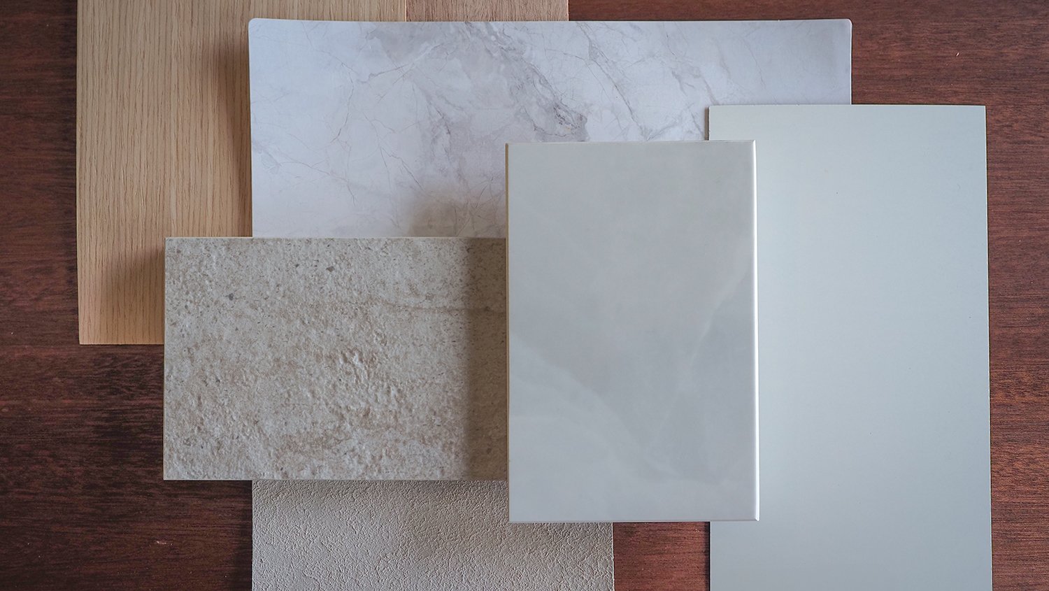
In total, we limited ourselves to ten materials:
Dominant warm timber
Travertine-like stone material
Red Rombini ceramic tiles from Mutina
Warm Japanese textured wallpaper
Mahogany timber accent (countertop)
White matte laminate
Balau timber decking
Existing grey marble flooring
Existing dark brown timber doors
Grey external paint finish
Mapping this palette carefully across 3D visuals, we assigned each material its role: dominant, complementary, or accent—ensuring that hierarchy, spatial rhythm, and texture variation supported the home's design language.
Utility Zone (Kitchen & Bathroom)

Internal carcass of the cabinetry exposed
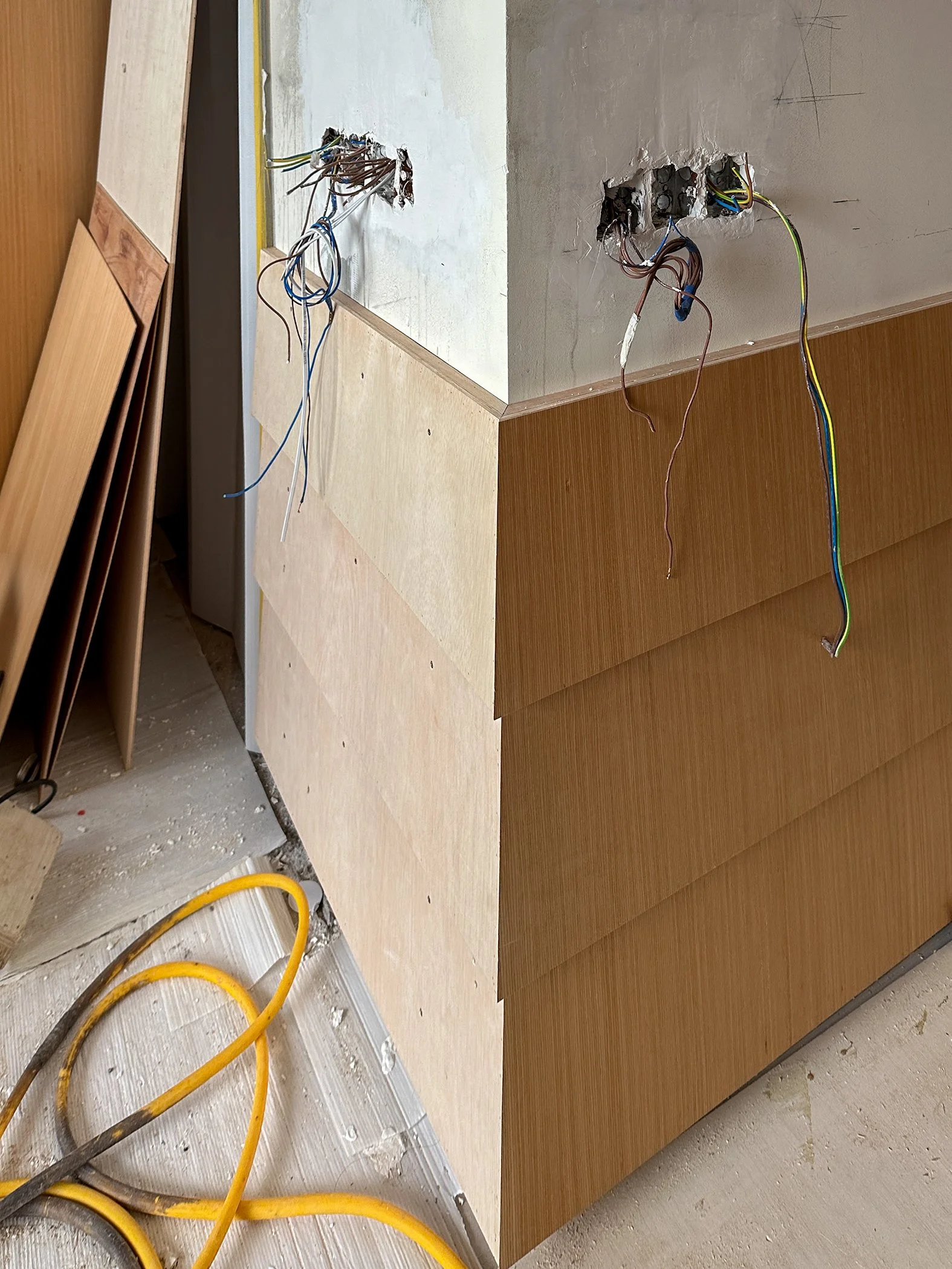
We kept the original layout of the kitchen and bathroom intact to avoid unnecessary rerouting of services. However, improving the design called for precise interventions—addressing material transitions, aligning junctions, and reinforcing visual continuity throughout the various zones. The developer's finishes lacked cohesion—particularly the poorly terminated Paradiso White countertop and the jarring structural beam breaking up the upper cabinetry line.
Our first step was to remove all external cabinetry doors and inspect the carcass. Structurally sound, the internal framework could be retained. This gave us the flexibility to redesign the doors and countertop with better integration in mind.
The main challenge was the beam. It visually bisected the cabinetry, compromising the illusion of spatial continuity. To resolve this, we thickened the cabinet doors by 10mm and used this added depth to panel both the beam and upper doors in the same timber material. The result was seamless: the beam disappeared into the cabinetry, a visual flow reinstated across the elevation.
Render of the conceptual treatment of the kitchen beam
The idea of cladding the beam in the same timber material as the cabinetry was established early—but technically, constraints were clear. The beam was flushed with the face of the existing cabinet doors, leaving no allowance for surface treatment. To panel the beam properly, we needed a build-up consisting of a plywood substrate (approximately 6mm), adhesive, and the timber material finish (around 1mm). This layering would cause the beam to protrude at least 7–8mm forward of the door face.

Top left corner - a structural beam runs across the top-hung cabinetry
We resolved this by thickening the cabinet doors by around 10mm—bringing them forward to match the new build-up on the beam. This simple but precise adjustment allowed the entire elevation to align flush, maintaining a continuous material plane and restoring visual cohesion.


Next came the stone. Initially, we explored termination details for the backsplash that wouldn't conflict with the living room beyond: trims, screens, soft edge terminations. None felt right. The breakthrough came from Superpotato's Takashi Sugimoto—whose monolithic, tactile designs inspired us to treat the backsplash and TV feature wall as one singular stone expression.
This approach not only unified the Utility and Living Zones visually, but also reinforced the material hierarchy by anchoring both ends of the space with the same textural mass. Technically, the execution wasn’t straightforward. Applying a stone finish to the TV feature wall required a plywood backing, adhesive, and finishing material—resulting in a substantial build-up in thickness. If the kitchen backsplash and the TV wall were to read as a singular surface, the depth alignment had to be exact.
We retained the internal carcass of the kitchen cabinetry, so the only way to align both surfaces was to thicken the backsplash stone to match the projection needed on the TV wall. This required careful verification to ensure clearance for the induction hob, sink, and countertop usability. Thankfully, there was enough room. The decision was made to push the backsplash forward, matching the depth of the TV wall. This also gave us the opportunity to recess portions of the TV feature wall to house LED lighting—a detail that added depth and quiet drama to the living area.
Flex Zone: Study Area
The recessed study space came with its own set of challenges. Encased on all four sides with a recessed ceiling, the area lent itself naturally to some sort of architectural framing. We decided on a timber strip ceiling design—a treatment we would mirror in the bedroom—to represent a consistent visual language between both zones.
But ceiling depth was limited due to the aircon fan coil unit above. With only about 125mm to work with (to accommodate recessed lighting), we pushed even further: designing 3mm plywood strips wrapped in timber laminate, laid across a recessed base with shallow groove lines. The resulting effect mimicked high-end V-groove panels while maintaining minimal thickness and visual subtlety.
Initially, we planned to seal off the toilet entrance beside the study to create a clean wall for full-height cabinetry. But on-site, it became clear the removal of the door frame would risk cracking the marble flooring. With additional M&E complications and ventilation concerns, we scrapped the idea.

Close-up shot of the open shelve’s detail
Instead, we designed a 400mm deep floating desk wrapped in our dominant timber material with white laminated drawers opposite the toilet entrance. With no need for chunky storage, we introduced open shelving above—detailing it with reverse chamfered edges to elevate the minimalist forms. The thickness of the shelves was deliberate, adding visual weight to their otherwise airy composition. LED strip lighting beneath the shelves provided necessary illumination, while a spotlight directed at the wall created a contemplative corner for display.

Flex Zone (Study) carpentry design detail
Beyond its function as a workspace, the study area was conceived as a flexible extension of the transitional zone. Its proximity to the entry meant it could play multiple roles depending on how the home was being used—acting either as a quiet corner for work and contemplation, or as an expanded part of the passageway leading into the living zone. By keeping the built-ins minimal and the floor space unobstructed, the zone remains adaptable.
Flex Zone: Balcony

Flushed interior-to-exterior flooring
The balcony was always meant to be an extension of the Living Zone—the usual spatial extension strategy by most condominium dwellers was still relevant here. Zip blinds were installed, allowing the interior footprint to stretch outward and reclaim usable space. But the physical transition had to be seamless too.
We chose not to hack the existing outdoor tiles to preserve the developer’s waterproofing warranty and minimize unnecessary works that might compromise drainage integrity. Instead, we overlaid the surface with Balau timber decking—aligned flush with the interior marble flooring. The sliding door track was carefully recessed to maintain a level threshold, ensuring both functional accessibility and visual continuity.
Balau’s warm tone echoed the timber used inside while solving for drainage and slip resistance. Its use also referenced the material vocabulary of Singapore’s landed homes, where Balau or Chengal are commonly used in pool decks, terraces, and pergolas—bringing that familiar exterior expression into a more refined, compact interior context.
Lighting was minimal but deliberate. The motorized zip blinds came with integrated LED strips to provide ambient lighting when the blinds were down. For use in isolation, a ceiling fan with built-in lighting created a quiet, breezy nook for reading, relaxing, or light work.
Transitional Zone – Directing Movement
The transitional corridor between the study, bathroom, and main living areas posed a unique challenge. It was neither a space to linger nor a wall to leave bare. Yet, its visual impact was critical—it was the first interior surface seen upon entry and needed to set the tone for the entire space.
We aligned the height of the wall feature with the half-height countertop in the Living Zone, creating a consistent visual line across the home. Inspired by Japanese timber façades and old weatherboard cladding, we introduced angled horizontal battens across all three walls of the transitional area. These subtle lines guided the eye forward, leading naturally to the Mutina tile feature and countertop beyond.
Initially, we considered terminating the batten detail at each wall's edge—treating the walls as discrete planes with framed ends. But this approach created visual breaks that disrupted flow and made the narrow corridor feel even more compressed. Instead, we chose to run the batten lines continuously, wrapping them seamlessly around all corners and wall junctions. This continuity visually stretched the space, reinforced movement, and stitched the transitional zone together as a single architectural gesture. The construction was burdensome, but not technically impossible—making it more of an exercise of orchestrating intentions instead of complexity.


We next explored enveloping the entire door frame of the bathroom in this timber feature—extending the detail beyond the wall to create a grand sense of entry and egress. The idea was to elevate the passageway into something more architectural, almost like stepping through a defined threshold that acknowledged the transition from one zone to another. By wrapping the entire frame, the original door casing would be hidden and visually merged with the battened feature wall, reinforcing material continuity. However, the material terminations at the floor and ceiling proved difficult to resolve cleanly, especially without damaging the existing marble tiles. In the end, we opted for clean timber edging around each doorframe, treating them as quiet pauses within the horizontal flow—and extended the battened treatment across the walls with careful precision.
The final execution featured seamless runs across corners and elevations—almost like a skirting with angular presence—tying into the geometric language seen in the Mutina tile detail and anchoring the corridor as a quiet yet directional zone.
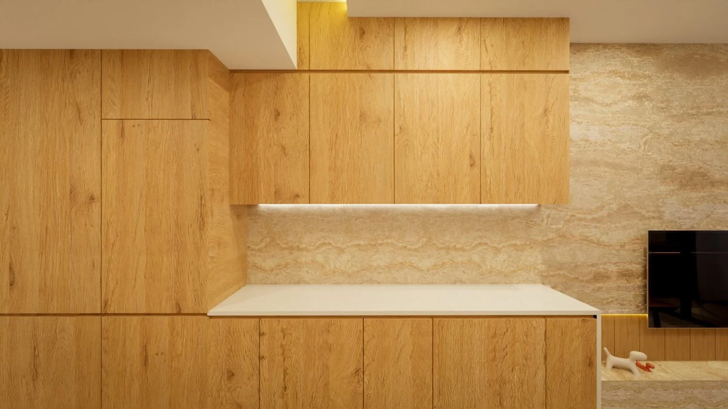
Living Zone – Integrating Living and Resting

Cantilevered floating platform bed and half-height countertop at the living zone
The Living Zone was the focal point of the apartment. Once the main door opened, all sightlines led here. To open up the plan, we removed the wall separating the bedroom from the living area and replaced it with a half-height countertop—permitting light and airflow to pass freely while preserving visual layering and intimacy between functions.
The existing floor-to-ceiling wardrobe was structurally intact and functionally adequate, so we retained its carcass. The upgrade came in the form of new finishes: the sliding doors were redressed in matte white laminate for neutrality, while the external carcass side was treated in our dominant timber material to maintain material consistency with the rest of the joinery. This allowed the wardrobe to visually recede while still contributing to the cohesive language of the room.

Platform bed carpentry design detail
Storage remained a key priority, and spatial constraints made it clear that conventional cabinet systems wouldn’t work. We designed a platform bed with integrated under-drawers—extending it to physically and visually connect with the half-height countertop. LED lighting below the platform and its cantilever created a floating visual effect, and a timber slat cushioned bedhead added architectural framing.
Above, the recessed ceiling in the bedroom was detailed with slim timber strips, reinforcing the zone’s spatial identity. Privacy was addressed through a dual-layered approach that balanced material expression with spatial sensitivity. Overhead, sudare blinds—inspired by traditional Japanese bamboo screens—were installed at the aircon box-up. Their woven texture allowed for filtered light and semi-privacy, softening the visual connection between the bedroom and living area without fully enclosing the space. Below, at the entry point of the sleeping zone, a noren curtain was introduced as a flexible textile threshold. Its flowing form could be drawn aside or closed as needed, offering a sense of movement while evoking the quiet rituals of traditional Japanese interiors.
Together, the sudare and noren formed a cohesive privacy system—one that responded to shifting needs throughout the day. Neither acted as a hard barrier, yet both contributed to a layered and intentional sense of spatial separation.


The half-height countertop itself became a key design anchor—both spatially and visually. Originally, we aimed for a triple reverse chamfer profile to sculpt a dramatic form. However, limitations in veneer fabrication (which can only bend cleanly in two directions) forced a re-evaluation to a double reverse chamfer profile with the third being flat-edged profile with a cantilevered top detail. This detail—reminiscent of Roman column proportions—cast a soft shadow and gave the piece a sense of visual gravity without excess. The countertop was wrapped in a warm mahogany veneer to subtly distinguish it from the dominant timber used everywhere else. The wall beneath was clad in Mutina’s red Rombini tiles—each hand-laid without grout lines after removing the factory mesh, creating a lacquer-like tactility reminiscent of traditional Japanese finishes.
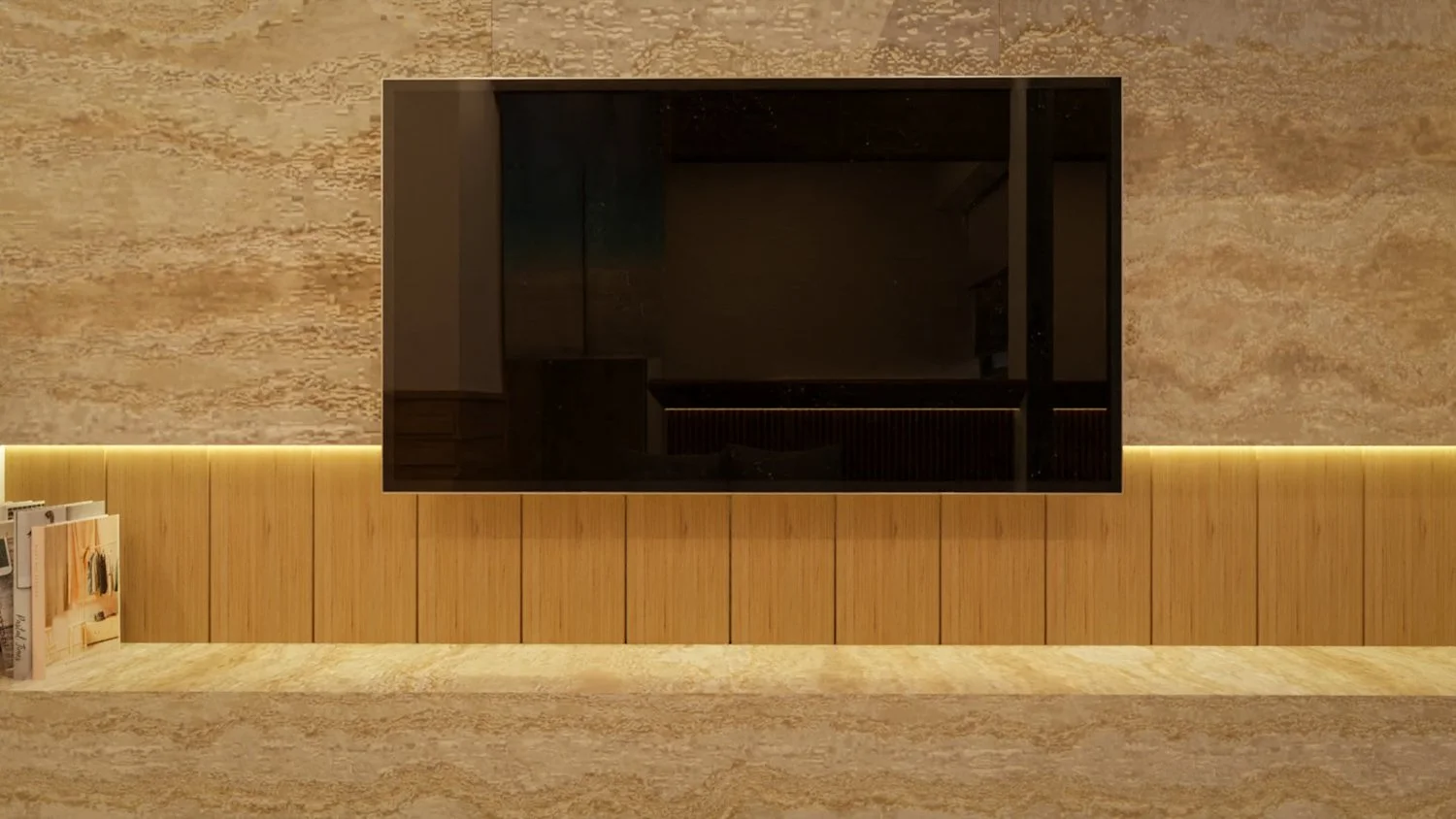
The TV feature wall continued the theme of spatial integration. It was clad in the same travertine-like sintered stone used in the kitchen backsplash, forging a direct material connection between the Utility and Living Zones. To avoid the common fragmentation seen in many compact layouts, we extended the stone across the elevation as a singular surface. A timber panel—recessed slightly to accommodate LED backlighting and manage cable runs—formed the TV’s mounting surface. A 65-inch TV was deliberately selected—not for sheer scale, but for its dual visibility. Thanks to the half-height countertop, sightlines remained unobstructed, allowing the screen to be comfortably viewed from both the living area and the bed. The size struck a balance between immersive viewing and spatial proportion, anchoring the TV wall without overpowering the room.

A deliberate design decision to have a 65-inch TV to be viewed from the bedhead
Importantly, we made a conscious decision not to turn the TV console into storage. Given the limited depth available (due to the proximity of the sliding balcony doors), any cabinetry would have compromised circulation and disrupted the clarity of the wall’s visual line. Instead, the console became a minimalist platform—one that visually anchored the space without overburdening it.
The end result was a space that moved naturally between living and resting—where each function had its place without needing separation. It captured the original design ethos not through exaggerated forms and complex solutions, but through careful calibration of proportion, texture, and sequence.
Lighting & Ceiling Strategy
The lighting design was shaped around recessed downlights as the primary lighting strategy, necessitating a minimum false ceiling depth of 125mm–150mm throughout most areas. However, the presence of air-conditioning fan coil units in key locations such as the study and kitchen created spatial conflicts.

In the study, we opted out of using a full false ceiling due to the tight clearance above the fan coil. Instead, we relied on ambient lighting from LED strips placed under shelving, combined with targeted spotlights for illumination and display. This approach reduced bulk and preserved headroom while maintaining a warm, usable atmosphere.
The kitchen ceiling posed a more complex issue. A full ceiling drop would obstruct airflow and servicing access to the fan coil unit—yet omitting a false ceiling wasn’t an option, as the adjoining living area required recessed downlights to maintain a clean, continuous visual plane.
To work around this, we introduced an L-box along the wall line, housing a concealed LED strip that cast ambient light upward toward the unit—solving both lighting and mechanical access challenges. Recessed downlights resumed beyond the fan coil zone where the ceiling cleared.
In the bedroom, the challenge was even tighter. Similar to the kitchen’s ceiling, the fan coil unit was nearly flush to the structural slab. Traditional ceiling drops or recessed fixtures weren’t viable. Instead, we treated the ceiling as an integrated feature. A timber strip ceiling design was applied across the sleeping area, using the same dominant timber material in the home. The treatment extended upward and wrapped around the L-box above the wardrobe and fan coil, creating a boxed-up ceiling detail that concealed services while maintaining material consistency. This move eliminated exposed services while giving the ceiling visual depth. The result was a warm, articulated overhead surface that reinforced the zone’s tactile quality—without requiring intrusive mechanical changes.
Throughout the unit, LED lighting was layered intentionally to create ambient depth and visual continuity. We designed ambient lighting into:
Beneath the platform bed
Bedhead recessed panel
Below the half-height countertop washing onto the Mutina tiles
Underneath the TV console
Kitchen overhead lighting strip
Study shelves
Floor-level perimeter groove at the transitional zone, creating a floating skirting effect
Installation & Finishing Strategies
Stone Feature Wall Alignment
Spanning approximately 2.7m x 2.8m—excluding the kitchen backsplash—the stone feature wall was designed to read as a singular, monolithic surface. From the beginning, the goal was to avoid the fragmented look common in multi-slab installations. This became even more critical when we decided to integrate the kitchen backsplash into the same material expression. Large-format travertine-like sintered stone slabs were selected, and we collaborated closely with our installers to determine the most effective orientation. The grain was laid horizontally—drawing the eye toward the balcony and reinforcing the unit’s elongated spatial flow.

Installation required tight coordination. Each slab was positioned to ensure the veining continued seamlessly across panels. Marble gum was applied with extreme care, resulting in virtually invisible joints—even under close scrutiny. From most viewpoints, the wall reads as a single continuous surface.
The technical challenge came in aligning the stone flush with adjoining elements. To maintain a unified visual plane, we installed the stone first and then slid the kitchen countertop into place—ensuring the only visible joint was along the horizontal plane, where it would be least perceptible and noticed only when looking downward. This also allowed us to introduce a recessed zone within the TV wall, using vertical timber strips, mimicking the timber strip ceilings, and integrated lighting to subtly layer the composition without disrupting the stone’s presence.
The final result feels calm and intentional. What could have been a patchwork of stone now reads as one continuous surface—anchoring the Living Zone and tying into the kitchen seamlessly. The recessed timber detail adds a quiet layer of texture, while soft lighting brings the surface to life without taking away from its simplicity.
Half-Height Countertop Construction

Romanesque profile in the half-height countertop
The half-height countertop was one of the most symbolic and spatially strategic elements in the unit. It served as a soft divider between the bedroom and living areas—preserving openness while subtly delineating zones. As the main visual anchor along the central axis of the apartment, its detailing needed to be exact. The form was guided by a careful orchestration of geometry and tactility. Our initial design concept explored a triple reverse chamfer profile to create an even more sculptural silhouette.

However, once we committed to using veneer as the finishing material, fabrication constraints began to surface. Veneer, while flexible, can only bend cleanly in two directions—introducing a third angle would require overlapping cuts and result in excessive joint lines, ultimately disrupting the surface clarity.
We tested several veneer layouts, but none achieved the seamless appearance we required. In response, we pivoted to a refined flat-edge profile. But flat doesn’t mean uninteresting. Drawing inspiration from Roman column proportions, we introduced a cantilevered top edge—projecting slightly beyond the vertical face for a dramatic effect. This detail, while minimal in execution, offered a sense of formality and presence, anchoring the countertop within the spatial rhythm of the home.
Materiality was equally intentional. The top surface was rendered in a rich mahogany timber tone—differentiated from the dominant timber used throughout the unit, yet still resonant. This contrast established the piece as a visual moment in the home, without clashing with the larger material language. The face of the wall below was clad in the red Rombini ceramic tiles from Mutina, installed without grout, to create a lacquer-like finish that drew from Japanese design references.
Technically, the junction between the countertop and the tile face required precision. Any overhang or misalignment would have disrupted the continuity of both textures. The veneer-wrapped countertop was built first and templated to align with the tile edge.
From a usage perspective, the height of the countertop was calibrated to sit just above bed platform level—reinforcing spatial alignment across both zones. LED lighting was recessed into the underside, softly washing over the Mutina tile surface and bringing out its triangular geometry.
The result was a built form that performed multiple functions: spatial marker, privacy screen, material showcase, and atmospheric light source. More importantly, it was a detail that merged form and feeling—creating a sense of pause and transition within a home designed around flow.
Mutina Tile Installation

Installing the Rombini Brun ceramic tiles from Mutina was one of the most delicate detailing exercises in the project. These small, triangular red tiles were chosen not only for their bold tonal impact but for their tactile resemblance to Japanese lacquerware. The intention was clear: to create a feature plane beneath the half-height countertop that would feel ceremonial, precise, and uninterrupted.
However, the tiles came pre-mounted on mesh sheets in sets of five—designed for conventional installation with consistent grout spacing. But conventional wouldn’t work here. Any grout line would break the continuity of the form and disrupt the very precision we sought to achieve. The solution was to reject the typical method entirely.
We instructed our installers to remove each tile from the mesh and discard the backing entirely. This allowed for edge-to-edge placement without any spacer guides. The decision significantly increased the time and effort required, as it became a fully manual process, with alignment, leveling, and visual rhythm all relying on pure craftsmanship.
What complicated matters further was the materiality of the tiles themselves. Their angular geometry meant that any misalignment—however small—would result in noticeable tapering or inconsistent joints.
The payoff was significant. The final wall surface reads as a finely woven field of geometry—rich in texture, strong in color, and free of any visual noise. No grout lines. No gaps. Just a continuous lacquer-like rhythm that adds weight and meaning to the connection between the bedroom and living space—allowing them to be read as one cohesive Living Zone.
Silicone Detailing
One interesting detail we paid attention to was the silicone.
Three types of silicone were applied across the unit: clear, light grey, and white. Clear silicone was reserved for mixed-material junctions—such as timber to stone—where visual neutrality was key. White silicone was used sparingly, only where white-on-white surfaces required a clean seal.
Light grey silicone presented a particular challenge. While it matched the tone of the stone, its sheen caught light at certain angles—creating unwanted visual reflections. To manage this, we employed a strict tape-and-trim protocol: painters tape ensured accurate application boundaries, and any excess was carefully cut back with precision tools. This achieved a near-invisible finish across all seams.
One of the most refined details involved the kitchen countertop meeting the stone backsplash. The stone was installed first..The countertop was then slid into position against it, creating a clean overlap. This ensured that the only joint line was along the horizontal axis, making it nearly imperceptible from a standing viewpoint. By controlling the alignment and silicone application with precision, the final detail achieved a near-invisible finish that reinforced the visual continuity between kitchen and living zones.

Conclusion: Execution as Expression
This second chapter in the Inside Forett series showcases how vision becomes reality—not through dramatic gestures, but through attention, restraint, and resolve. It explores how those contextual relationships—between space and self, vision and constraint—are tested and translated during construction.
Design should never exist in silos. And when each part—light, material, joinery, form—is considered not in isolation, but for how it supports the whole, something more meaningful is achieved.
Next: Living with the Outcome
The final chapter explores how the completed home comes together through final detailing, styling, and reflection:
1️⃣ Final Material & Furniture Curation – Reviewing how each selection contributed to the lived atmosphere
2️⃣ Collaborative Craftsmanship – Insights into working with artisans, suppliers, and contractors to translate detail into reality
3️⃣ Design Integrity Over Time – Understanding how the space aged, adapted, and stayed true to its intent